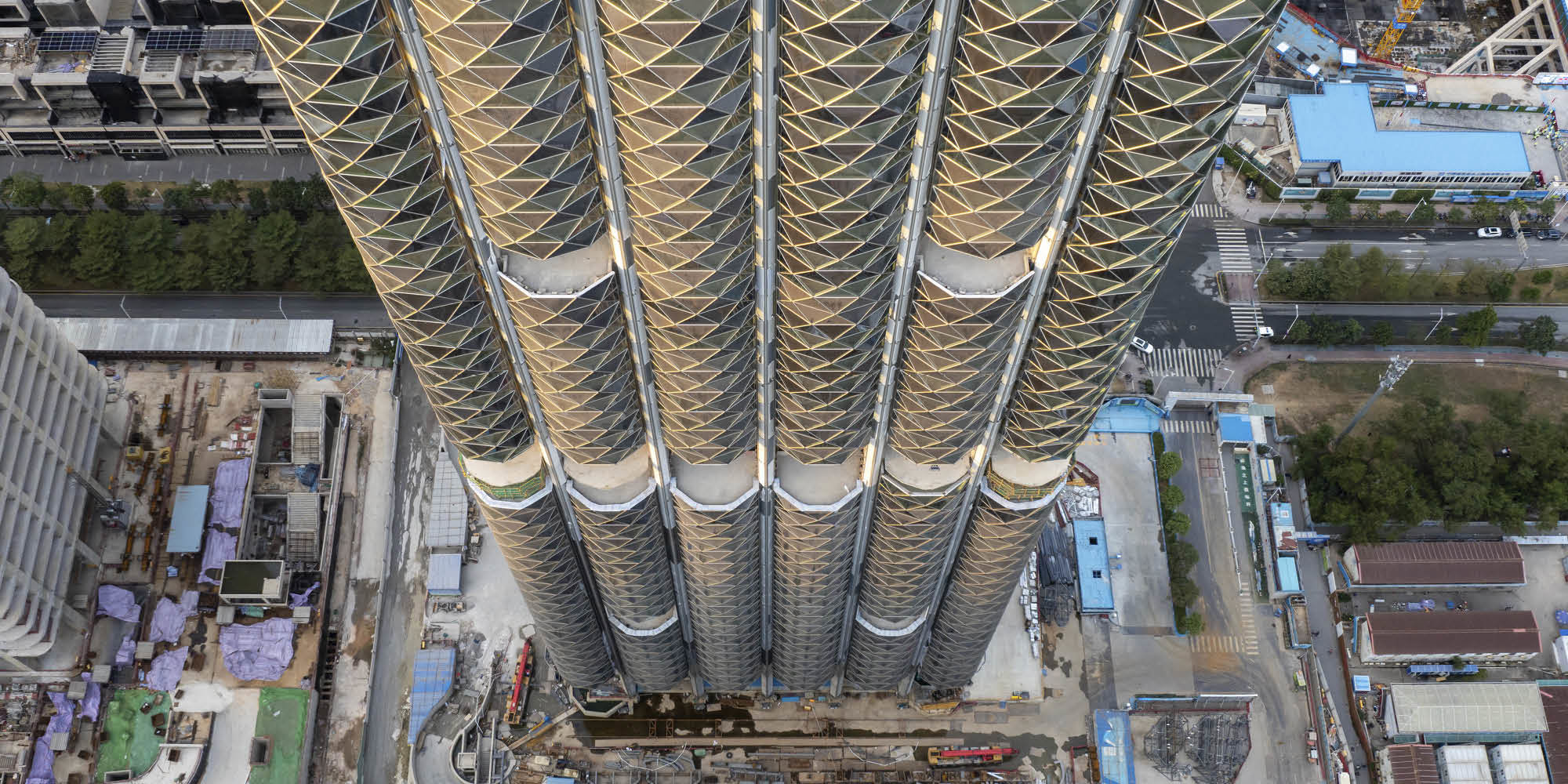
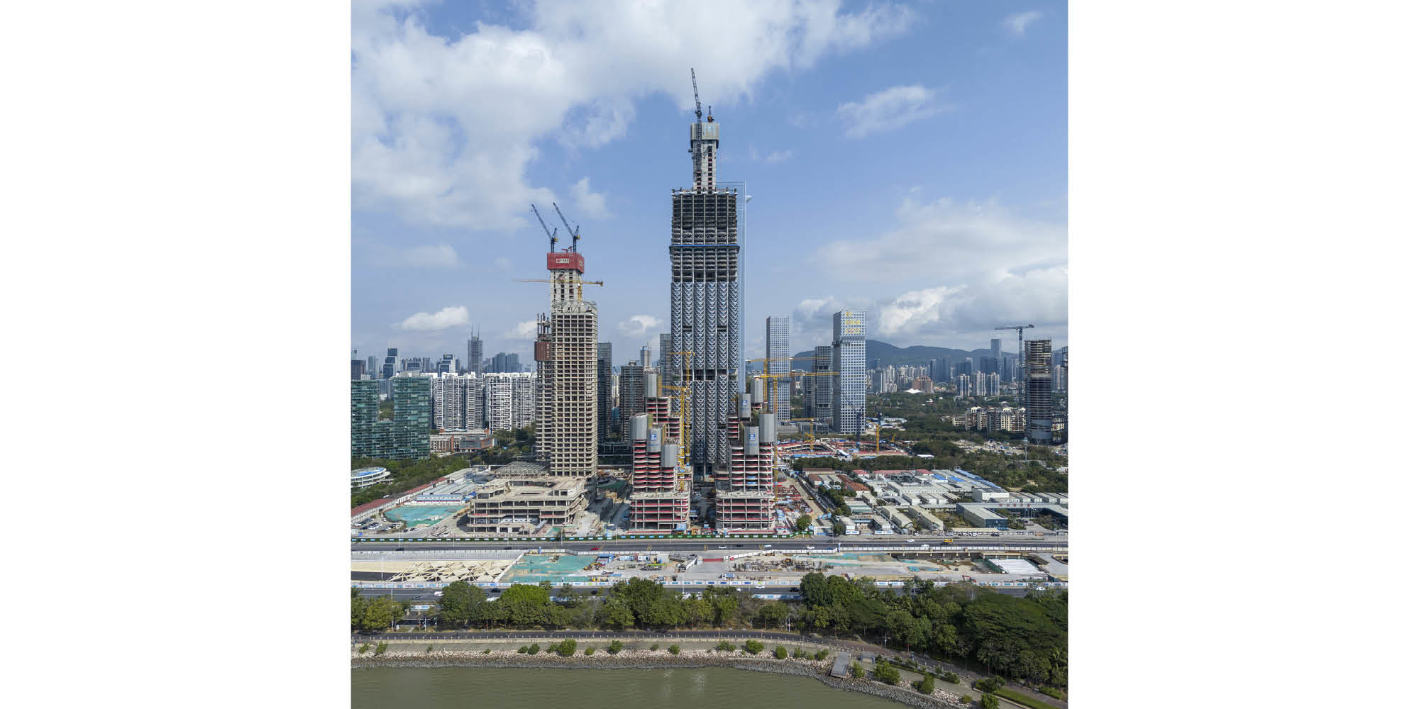
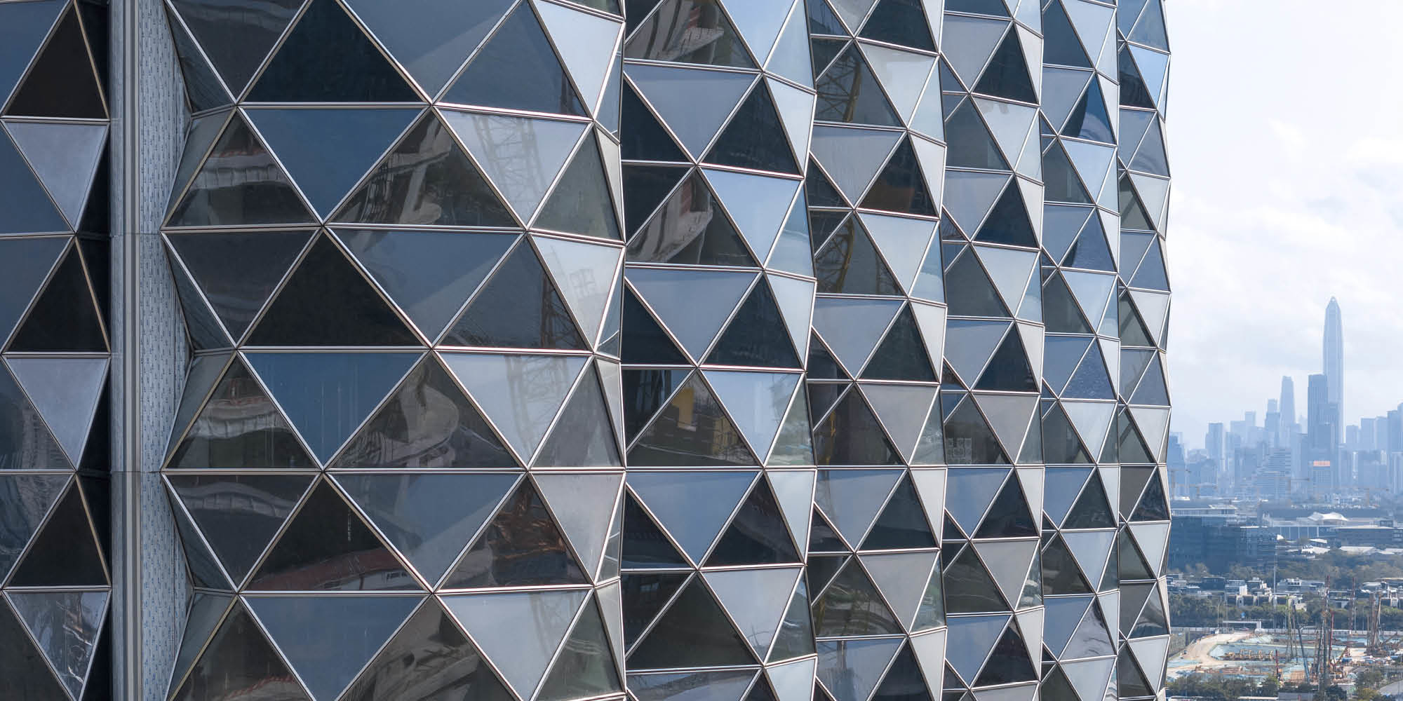
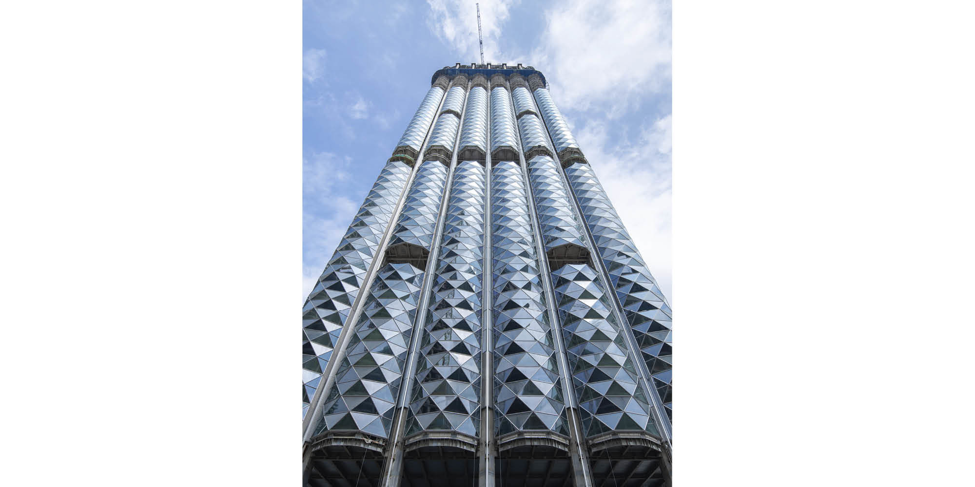
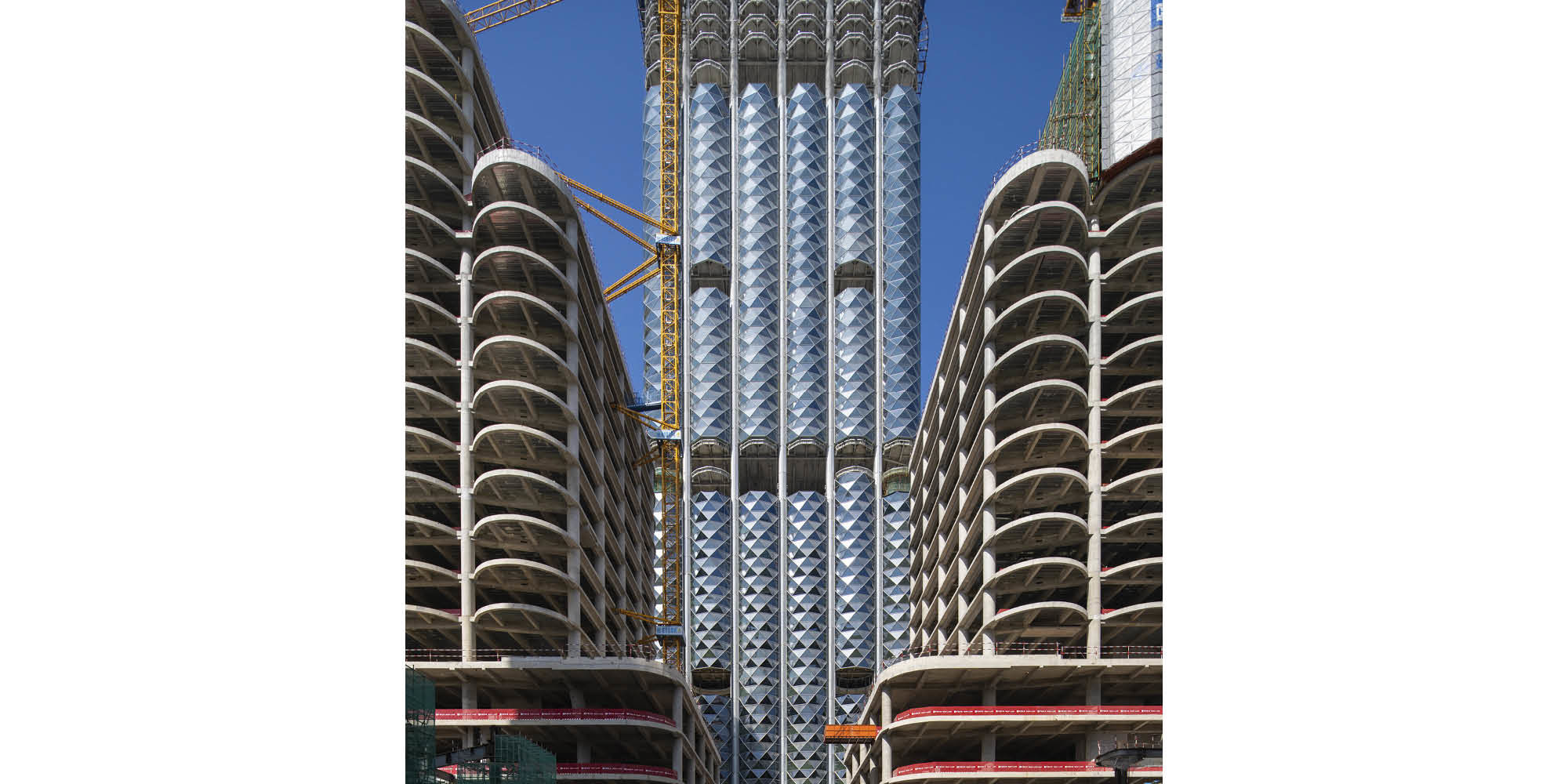
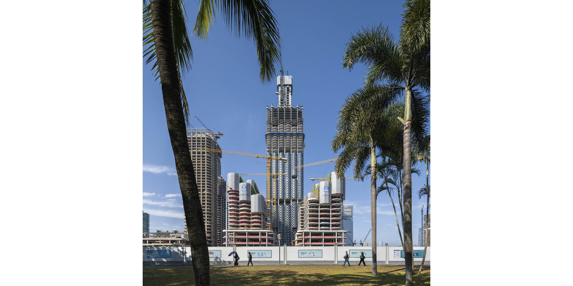
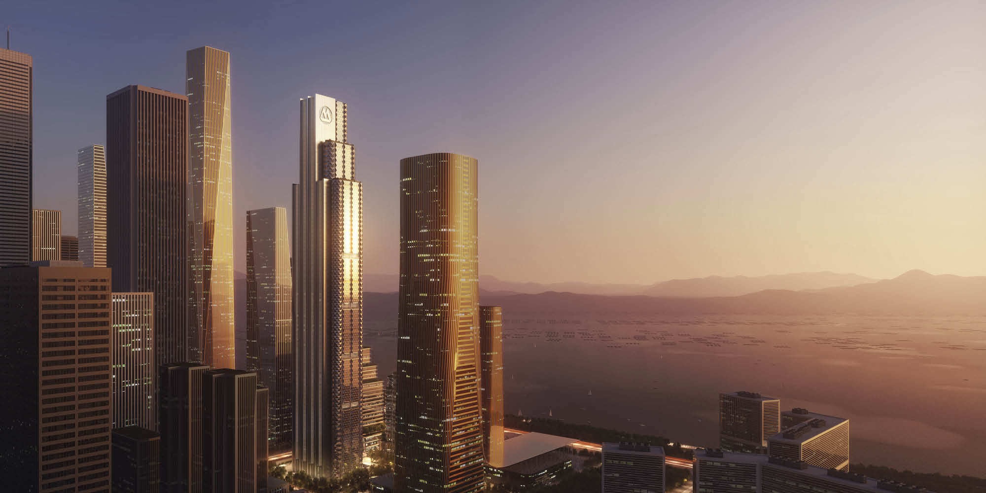
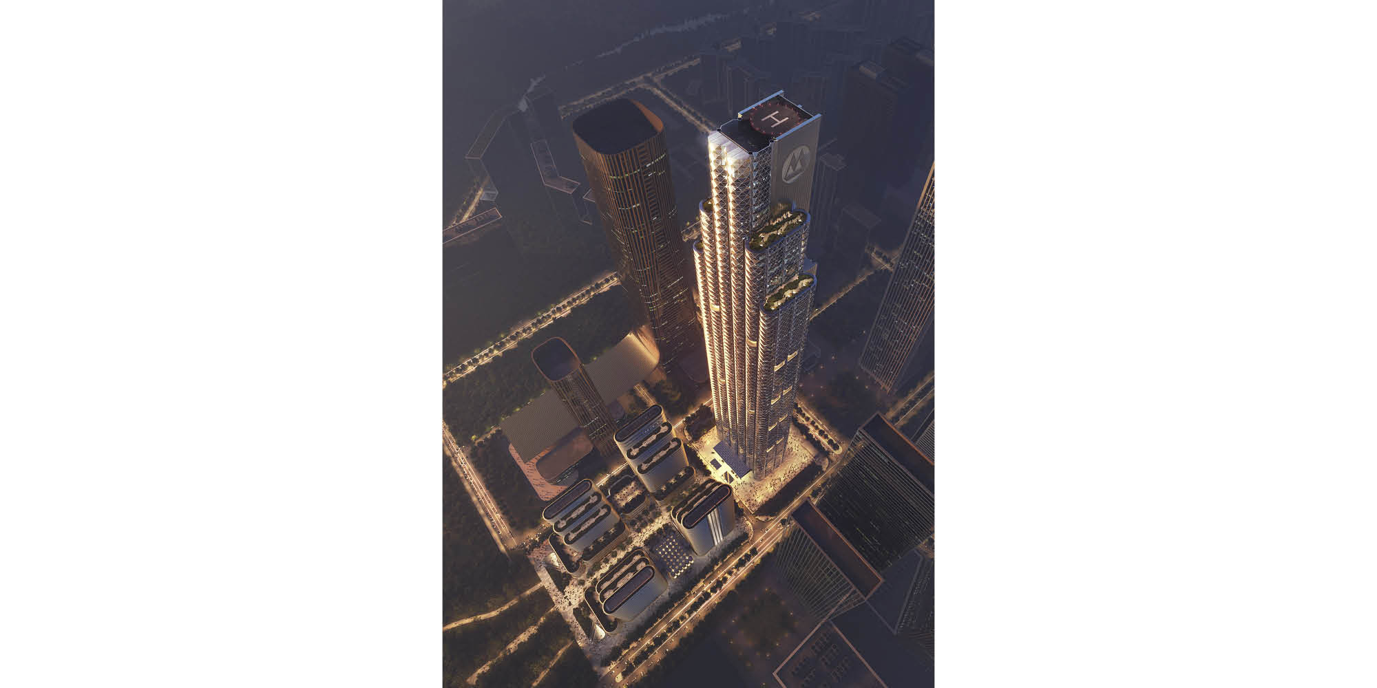
China Merchants Bank Headquarters in Shenzhen has topped out. Designed by Foster + Partners, the project comprises a striking tower as the key component of a vibrant mixed-use development that creates a new city quarter. The design of the principal north facade is influenced by rock formations in China, with stacked bays varying in height. The south-facing facade is inspired by the geometries of traditional paper folding, which is an important part of Chinese culture. The tower achieves three stars in the Chinese ‘Assessment Standard for Green Building’ - the highest rating available.
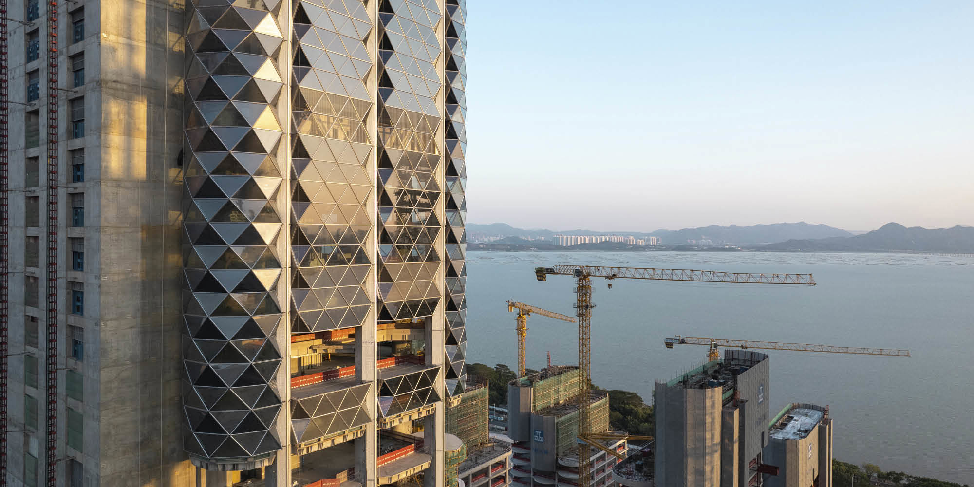
Grant Brooker, Head of Studio, Foster + Partners, said: “The new tower is a unique addition to Shenzhen’s urban fabric and will be an enduring symbol of China Merchants Bank. The building’s wide curved windows offer spectacular views of Shenzhen Bay. Cut to reflect the light, they glisten in the sun and reflect movement in the sky above them. We want to capture the warmth of sunrise and sunset on the building’s surface - so that the appearance of the tower is constantly changing and never appears the same way twice.”
The tower’s design reinforces the impact of the site’s panoramic views across Shenzhen Bay. The south-facing façade incorporates a series of triangulated bay windows, to optimise the tower’s outlook. Workspaces connect to double-height atriums and lush landscaped terraces at regular intervals. In contrast, the building’s northern facade is characterised by its simple, rectilinear form.
The tower’s façade, made from glass and stainless steel, is the result of an iterative modelling process to minimise the energy consumption of active systems by carefully balancing solar shading, daylight and thermal loads. The MEP systems respond to their context, adopting advanced technologies that allow smart control of the environment.
Optimal working conditions are achieved through low emission materials, effective temperature and humidity control, and glare mitigation. Coupling the off-centre core layout with a unique natural ventilation detail in the column profiles allows for natural ventilation on all levels. This high-quality indoor environment enhances staff wellbeing and improves productivity.
At ground level, an elaborate layered ceiling is made from textured stainless steel and acts as a foil to simple stone walls. Striking water features and greenery connect the building’s occupants with the natural world.
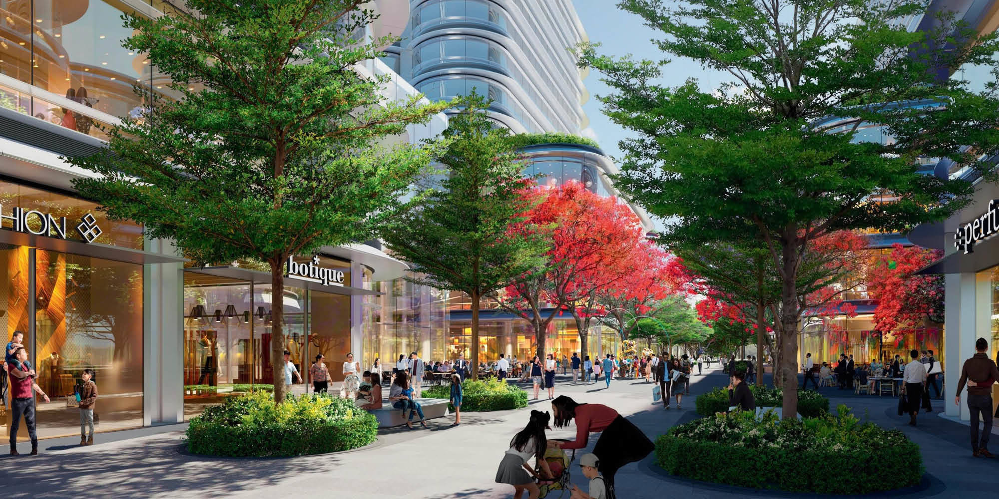
The mixed-use development, on the south side of the site, responds to the urban scale and character of its surroundings. The development includes retail and cultural facilities for the local community, as well as offices, a hotel and conference centre. A central axis connects the city’s public park with the tower and intercepts with two new plazas. The vibrant central plaza will host a variety of events and is surrounded by shops and restaurants on all sides. The development is oriented towards the public park and has green landscaping woven throughout.
Fresh water conservation and on-site retention of stormwater is achieved through a combination of design strategies that also meet the ‘sponge city’ requirements for a new development of this scale.
