Proposals for a new 42 storey tower in Manhattan, to be placed over a landmark art deco building, have been submitted to the New York Landmarks Preservation Commission. This fulfils a dream started in the 1920s, when William Randolph Hearst envisaged the area of Columbus Circle as a vibrant new quarter for media, communications and entertainment. He asked the migr Austrian architect, Joseph Urban, to design the first stage of a corporate Headquarters for his vast publishing empire. This was a six storey masonry block with a central courtyard, splayed corners and theatrical statuary. Finished in 1928, it was always intended to be topped by a tower, although no designs were ever recorded. Some seventy years later, such a tower is being proposed - the new combination of tall structure and a remodelling of the original base will provide almost a million square feet of space for one of Americas largest communications companies.
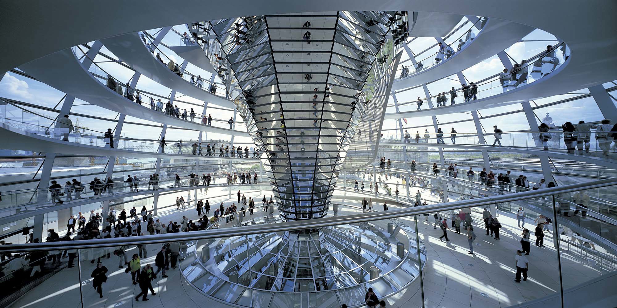
Foster and Partners were chosen last autumn for their combination of experience in high-rise buildings and work with historic structures, such as the Reichstag in Berlin and the British Museum Great Court. Norman Foster, describes their approach as combining the best of both worlds - the old and the new - to enhance the historic through a carefully orchestrated dialogue with the modern.
In that spirit the new tower is lifted clear of its historic base, linked on the outside only by columns and glazing, which are set well back from the edges of the site. This transparent connection floods the spaces below with natural light and encourages the impression of the new floating above the old.
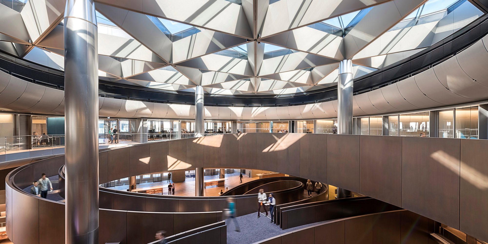
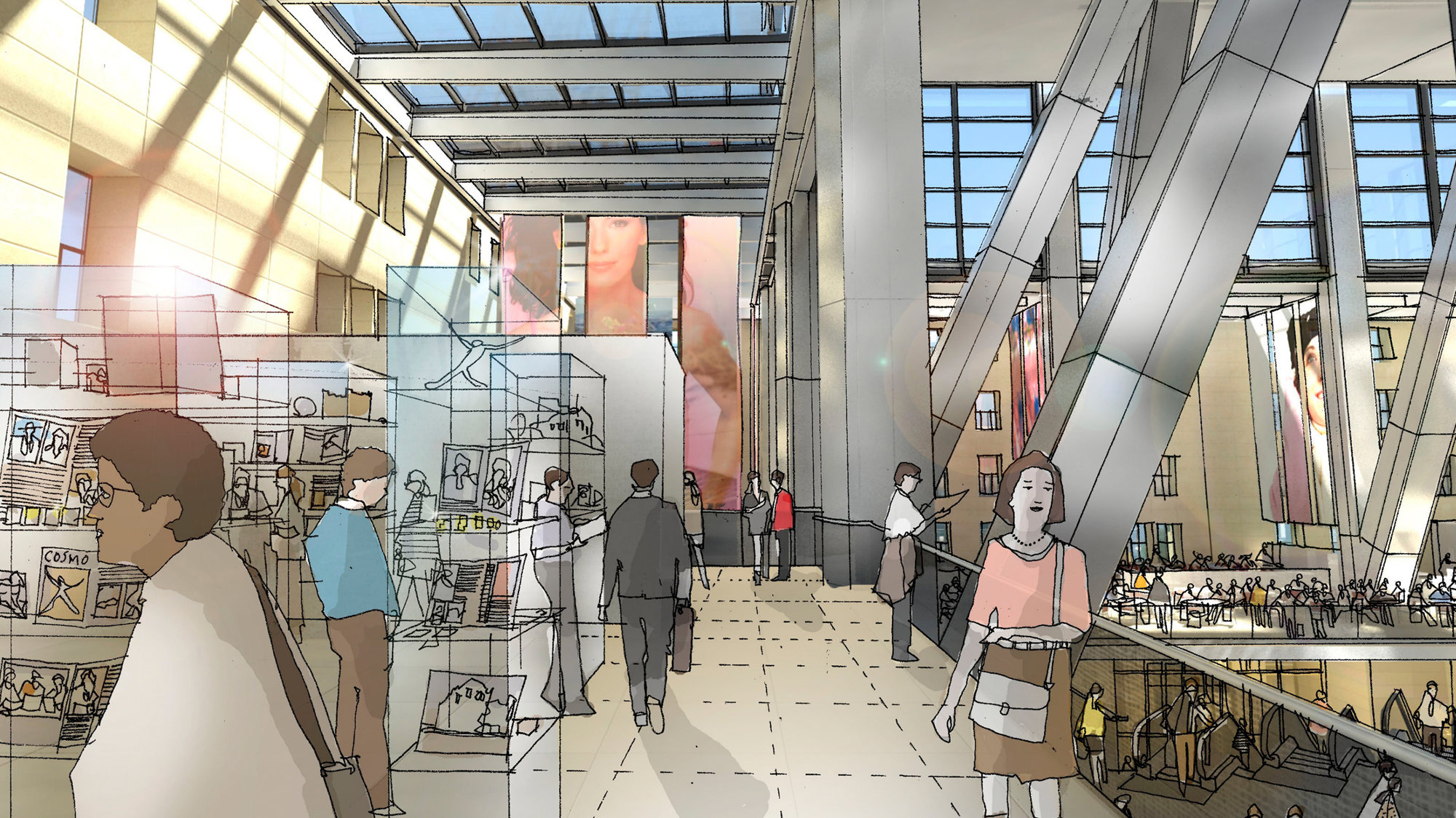
Archival research has led to the lower stories of the original building being reinstated, with separate street entrances for shops, subways and a lobby for the Hearst Corporation. Those who use and visit the tower rise by escalators from ground level, through an elliptical void, to a major gathering space, with cafs, restaurants, exhibition and landscaped meeting areas. In some ways this is like a town square, because it is surrounded by the inside facades of its own four storey high building the sun and sky above, visible through a glass ceiling.
Unlike a conventional tower, Hearst has a triangulated structure which is expressed in stainless steel on the outside. This is stronger and more efficient than the normal orthogonal grid of vertical columns and horizontal beams - this system also offers more structural redundancy. By peeling away the corners between the diagonals, the vertical proportions of the tower are emphasised along with the image of a distinctively facetted silhouette on the skyline. From the inside, this device also creates spaces which capture more dramatic views over the city, Central Park and the Hudson River.
