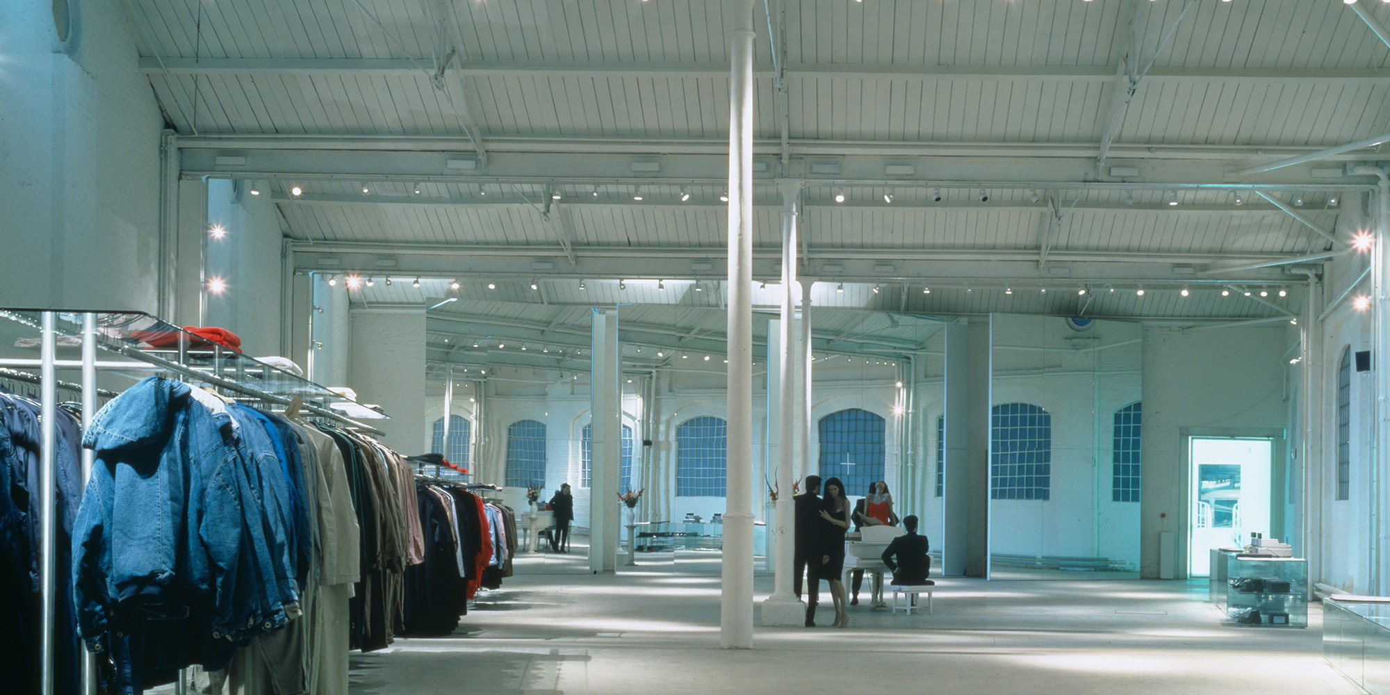
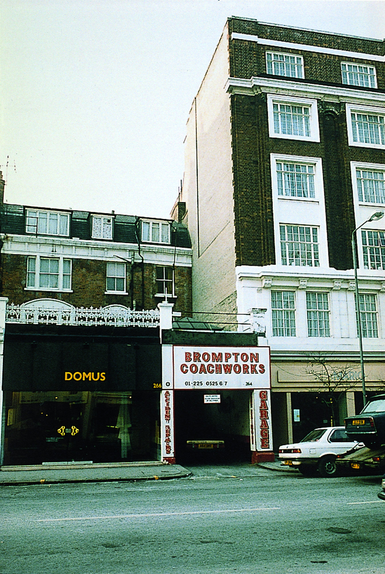
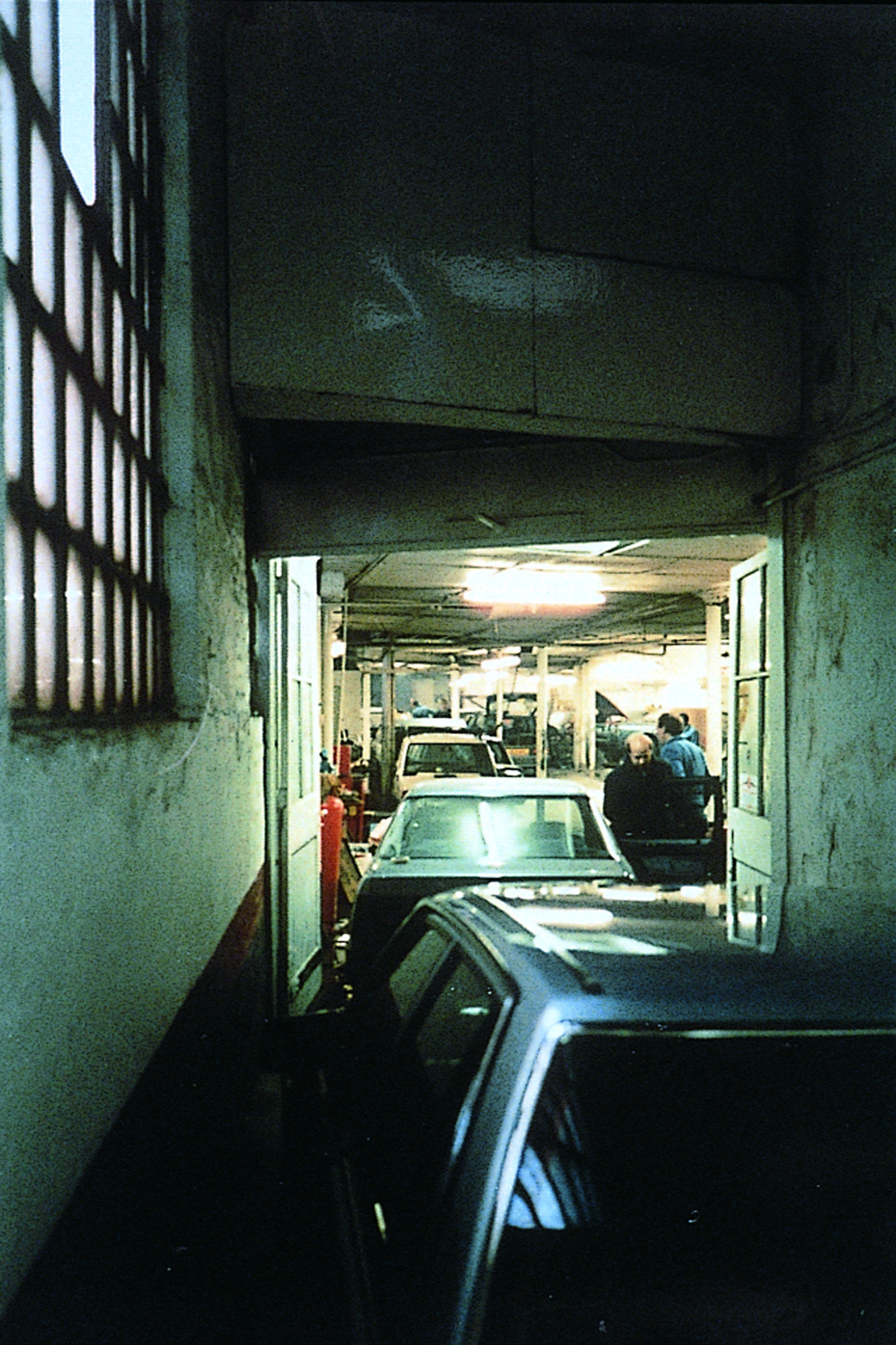
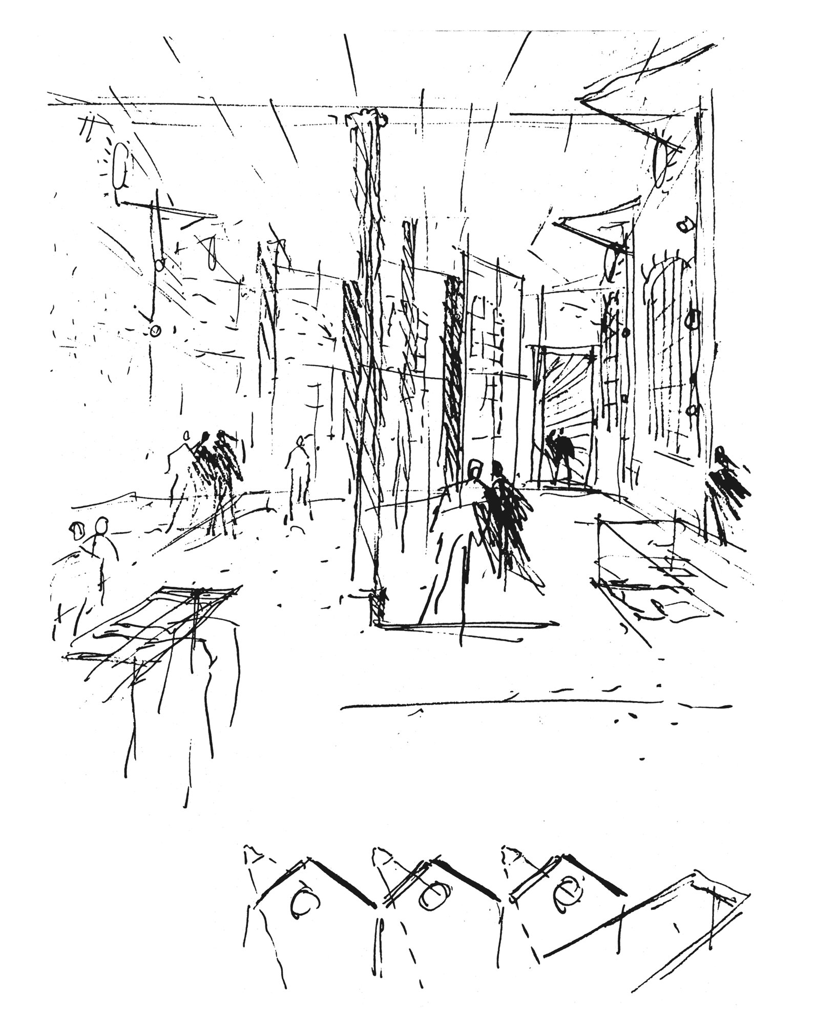
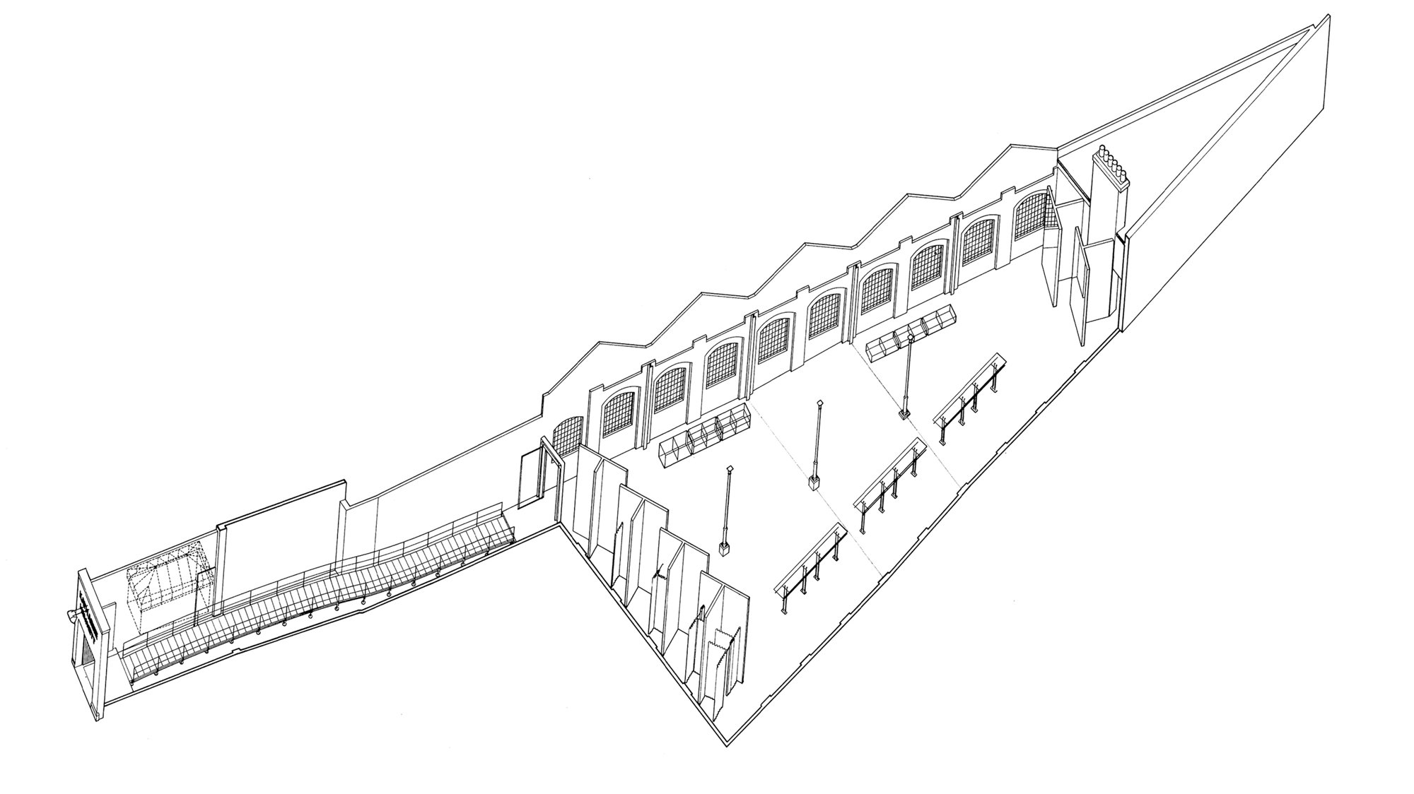
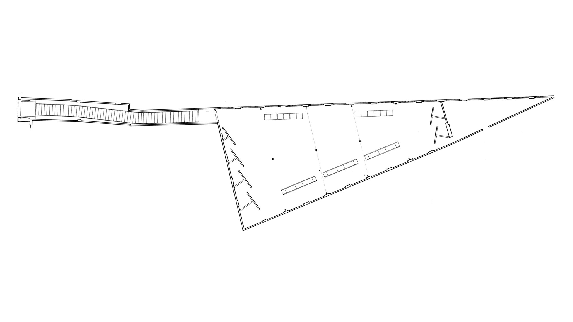
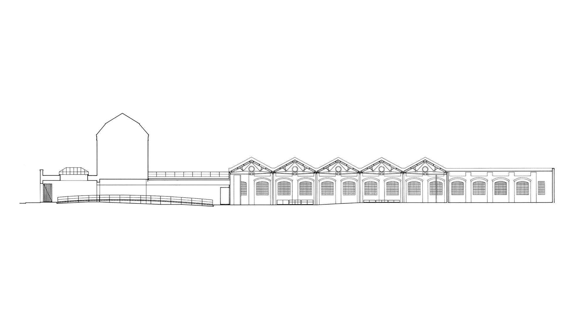
The challenge was to bring a two storey industrial slum back to its former glory of a noble single space and fit it out within very demanding time and cost limits. The only way the totality could be perceived was by preparing measured surveys and building a large model of the shell without the intervening floors. Meanwhile extensive engineering studies were made to examine how such a single space could be realised without the necessary additional strengthening destroying the best architectural features. Much ingenuity of “stitching-in” a ring of new steel lacework brought forward the best qualities of the existing structure such as the full height cast iron columns.
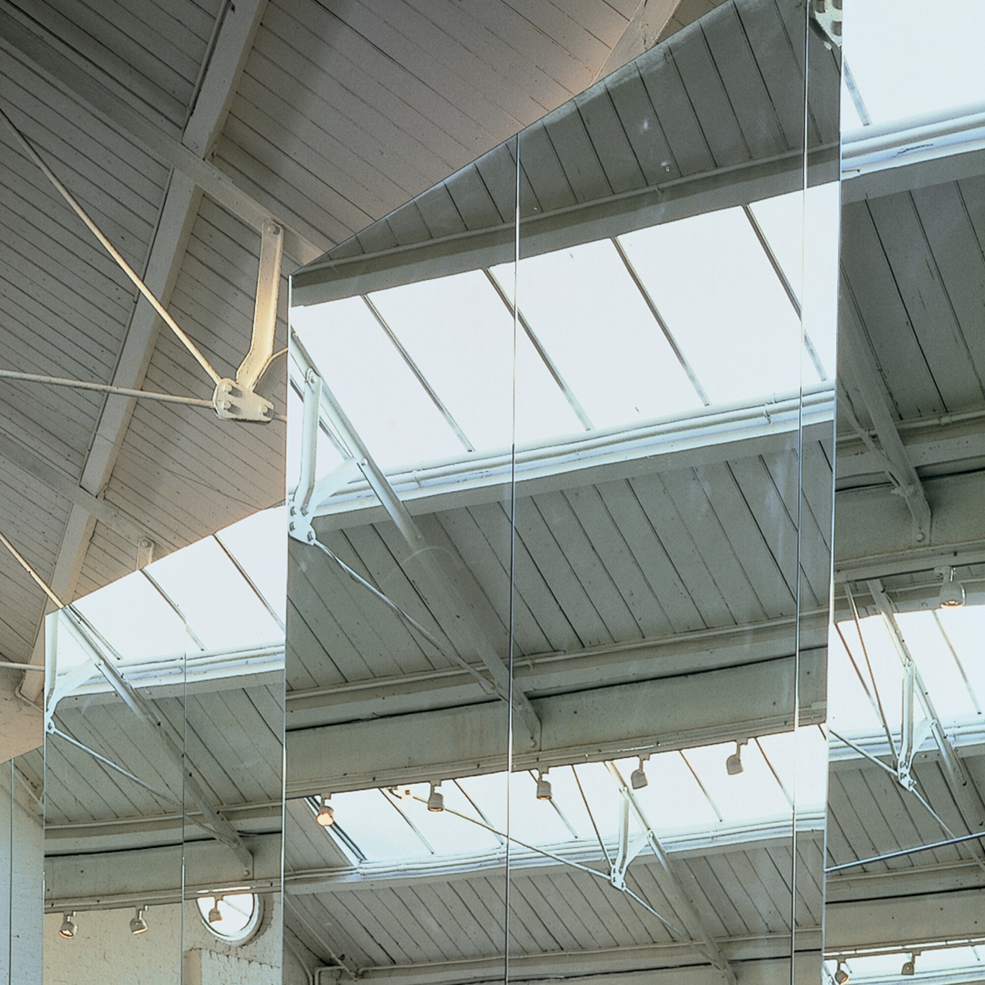
A range of design possibilities were explored in model form; the scheme as built was the fourth version - it was without doubt the simplest and the best of the various proposals. One of the difficulties was how visually to incorporate smaller scale elements such as changing areas and mirrors without them “demeaning” the space, and how to respect and enhance the scale of the main space. The device of large scale vertical fins integrated both those requirements in a way that was both discreet and positive. The number, size and angles of those find were the outcome of seemingly endless explorations on drawings and model studies.
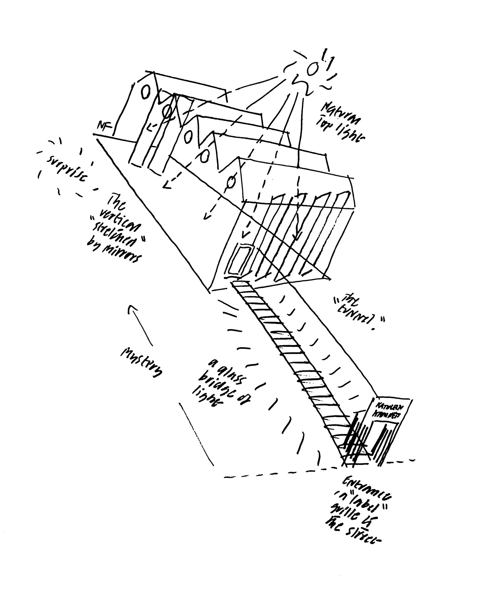
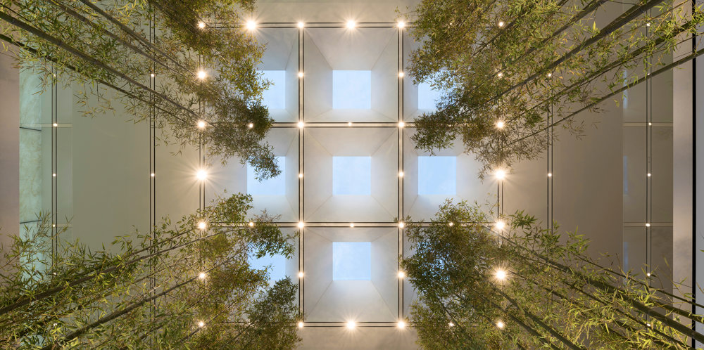
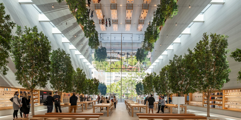
If space is one preoccupation in the design of this shop, then light - the quality of light - is the other. The space is brought to life by the combination of side light - the old industrial windows reglazed with white glass glow with a translucent effect - and direct top light from strips of roof glazing. At night the roof lights are lit from outside and give a gentle background light supplemented by moveable spot lights on tracks which pick up the structural geometry across the space.
The quality of light and space, predominately white finishes and generous use of mirrors, is evocative of ballet school or school or studio to provide a complementary setting for the clothes and their display. The aim was also to create a more timeless quality that would not depend on expensive or sophisticated furniture - aside from the fact that there was neither time nor money to afford them - they were frankly not felt to be appropriate.
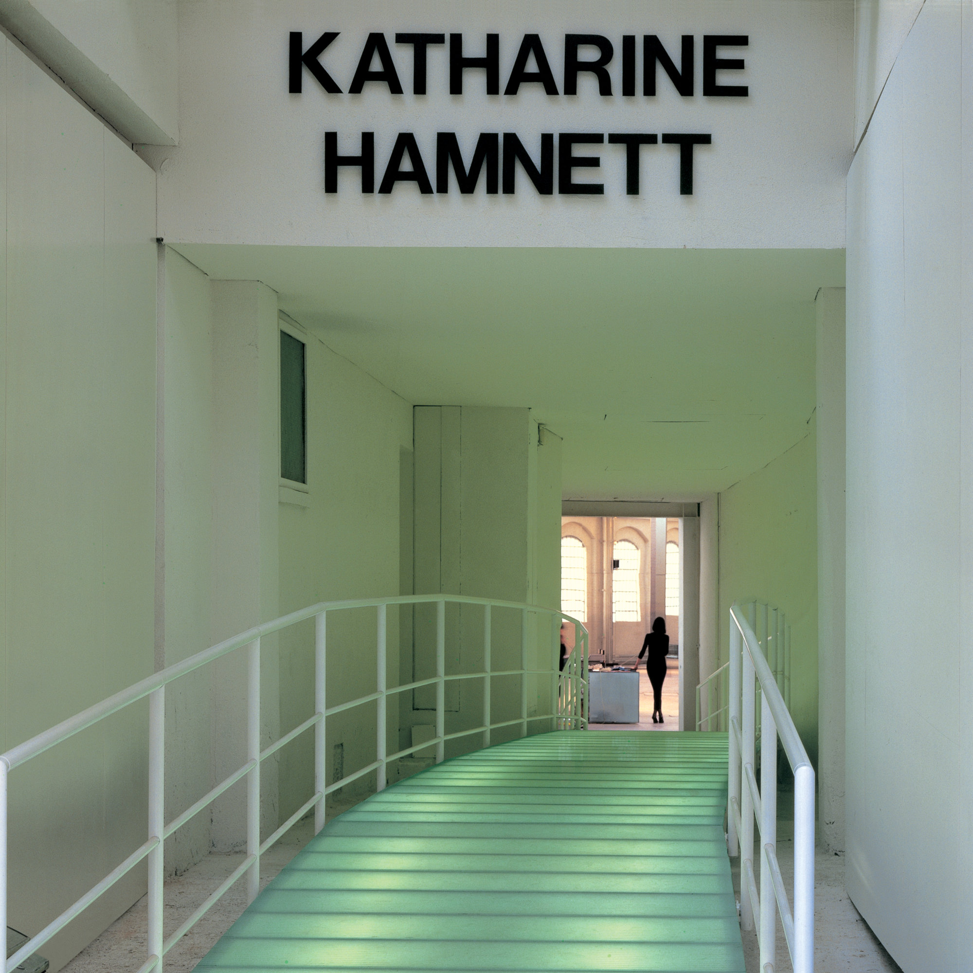
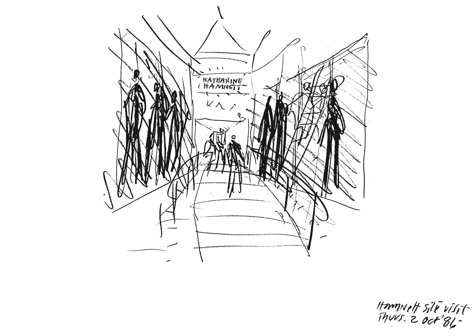
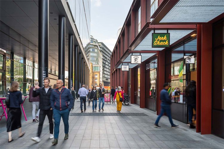
In that spirit the entrance which in reality was a rather scruffy tunnel is totally transformed by inserting a single pristine element - a glass bridge lit from below which meanders on plan and is a gentle arch in section - a conscious attempt to evoke mystery, contrast and drama.
